Tag Archive: User Experience Design
- 3d 3d printing Algorithmic Android Apple AR art Augmented Reality Automotive branding camera Car design Caricature Design Experiment Film Freeware Hardware hololens iMac Installation iPad iPhone IxD logo Mini POP POS relief Scanner Sculpture sheldon Smartphone Tablet tips UI User Experience Design UWA UWP ux UxD Video Virtual Reality windows XAML
-
On Microinteractions

Dribbble is full of cute UI animations and quite a few designers confuse them with microinteracations. Some people confuse it with a similar sounding word – “Drivel”. Many of those are more of an interstitial than a microinteraction. If they tell a story they can not be a microinteraction.
Microinteractions should serve the original experience. […]
... -
Better Context Menus

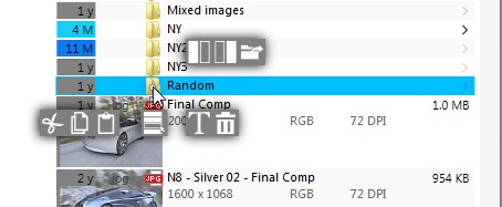
One of the UI behaviors that really influences user experience is how tight is the feedback loop. At the moment users see an unexpected wait/spinning cursor their forward train-of-thought is broken as they try to find causality for that feedback by remembering what they did a second ago.
In One Commander v1, and all other […]
... -
Usability improvement goals

- Maximize use of screen space
- Shorten key / mouse length for every action
- Use 80:20 rule use to present most needed information at glance
- Closer feedback loop – Making result of an action immediate
- Increased speed
This list is made for One Commander V2 but it can and should be on every end […]
... -
Vertical Screen Space

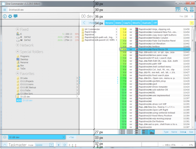
One of the biggest problem with One Commander I have recognized (and received complains about) is not enough vertical space for files. At the moment 230px of vertical space is unused.
On the height of 768px of 1024×768 screen:
- 5% Windows Taskbar
- 30% OC UI
- 65% File List
Starting from the top: […]
... -
Golden Ratio in UI Design

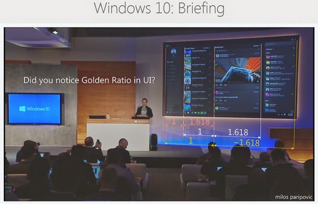
Watching this Windows 10 event I have noticed a pattern which I used a few times before. I had to remeasure the UI and it seems it was intentionally used – Golden Ratio. Coincidence or intentional design?
Whether one thinks there is something more behind Phi or not, it surely makes it more balanced than […]
... -